
Kaleidoscope Eyes: Pride Flags and When Color Theory Falls Apart
Published May 27th, 2020 by Amina Harper
Continuing her series on color theory, artist Amina Harper unpacks the history and muddled meanings of Pride flags.
Okay, let me level with you. I’ve been dreading this day for a long time now, and in anticipation for it I tried, I tried so hard to discern a language from our contemporary pride flags and I just couldn’t do it. Simply put, the colors are all over the place, and the ones that aren’t, are contradicting their intended purpose.
A lot of it has to do with the fact that pride flag color language isn’t universal, and every country has their own variation of each pride flag. And when I say “each” I mean that there are so many pride flags that there is no way on earth any two flags with the same meaning, even from the same country, would look exactly the same. I really stepped in it this time.
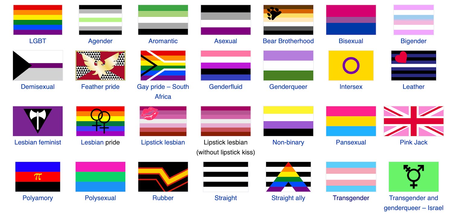 Source: Wikipedia
First, let’s talk about the flag, what it is and what it does. Aside from representing one's nation, a flag denotes ownership in the purest sense. When you plant or post a flag in the soil you are telling all those who see it that this land belongs to you. That usage and definition doesn’t necessarily change because of the hand holding the flag. The flag and its functions are deeply rooted in colonialism, and it makes perfect sense that, in an attempt to assert identity and elevate representation, we use the tools of the dominant forces within our society (ie: colonialism). This doesn’t mean that pride flags are tools of colonialism; it means that flags, as a tool of colonialism, are a confusing tool to use when showcasing the beautiful fluidity and diversity of the queer community. This is also perhaps a reason why the flags designs are so all over the place.
Now, there is a very sound argument in favor of the idea that pride flags aren’t about colors at all, but about representation for the wide spectrum of LGBT+ identities out there and that each one deserves to be seen and the cultures they represent respected; and that is 100% valid and true. But we still got all these colors and symbols to contend with, and it’s the colors that are doing the bulk of the representing, so it really benefits the community to have some kind of a language that is easily understandable so that the members of those communities can find the banner they feel best represents them, right?
So let’s try. Let’s try to uncover what pride flags are really communicating (or are trying to communicate), and maybe this will help us understand how the communities they represent see themselves.
First, let’s start with the rainbow flag that we all know and love. Designed by San Francisco artist Gilbert Baker, the first rainbow pride flag made its debut on June 25, 1978. It has been revised many times due to fabric availability, and the complexities with the hand dying and hand sewing process. The original flag looked like this…
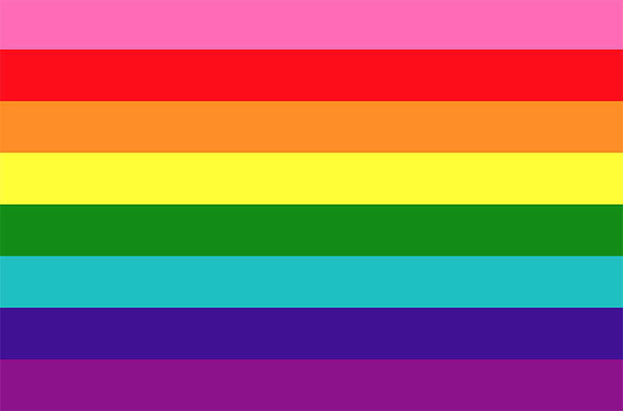
Source: gilbertbaker.com
What I think a lot of people don’t know about the original pride flag is that each color represented ideas and values that the LGBT+ communities held both then and now.
PINK = Sex
RED = Life
ORANGE = Healing
YELLOW = Sunlight
GREEN = Nature
TURQUOISE = Magic and Art
INDIGO = Serenity
VIOLET = Spirit
And I think it’s this lack of knowledge of LGBT+ history, mixed with discrimination that happens within the LGBT+ community that causes a lack of representation of certain identities, that muddled up the meanings of the current flags we have now that are all offshoots of this original one. There now seems to be this reading of pride flags that suggest the colors represent, not community values, but genders, specifically male (often represented by blue) and female (often represented by variations of pink). You can see these readings in the trans*, lesbian, some interpretations of the bisexual, and pansexual flags respectively. The problem with these usages of color is that they are counter to the idea that gender and sexuality are fluid and therefore cannot, should not, and do not subscribe to binary ways of thinking. However, using two colors as they pertain to antiquated binary understandings of gender contradicts these ideas. Not only that, but binary language is, in general, dangerous as it places one of two terms in a privileged and dominant position over the other, therefore governing the definition of the less privileged term in its own context.
For example, you know what a WOMAN is by knowing what she is not: a MAN. Just like you know what GAYNESS is because it isn’t STRAIGHT. This is how something culturally OTHERED becomes defined by the cultural DOMINANT.
Pride flags use this color coded and gendered language because binary language is what we in the western world were conditioned toward. But today, we are slowly learning that such language is limiting and can’t accommodate the nuance of human identity. Even when we aren’t using it to directly harm, if we want to be free from it we have to deconstruct it in our culture and in our art. This includes the banners we make to represent ourselves. This does not mean that individual pride flags shouldn’t exist, though it would be nice if we didn’t feel we needed them.
Outside of blue and pink, the other color codes in modern pride flags are inconsistent. This is where I think the confusion really starts, because I realized that not only do people not know what the original flag colors mean, they started assuming the colors represented the wide and ever increasing spectrum of sexual orientation labels and/or gender descriptors. This didn’t take potential overlap into account, so you have instances where the same color in two different flags don’t share a definition, or where two different colors have the same definition.
For example, the bisexual flag suggests that the pink (representing gayness) overlaps with the blue (representing straightness) to make purple (representing the combination of gayness and straightness, equaling bisexuality). But there are many flags where straightness is represented by the color black and gayness (or queerness in general) is represented by the entire rainbow spectrum, excluding pink. Another example is the pansexual flags yellow representing non-binary people, while the white of the trans flag represents the same thing. You see how confusing and frustrating this can be for a color theory nerd?
Now, there is an argument to be made that would suggest that sexuality and gender are fluid, so doesn’t it make sense that the colors used in their individual flags be fluid, too? On a surface level? Sure, that makes sense. But if that fluidity was truly present in pride flags, then why attempt to subscribe to color coded language in the first place? Why attempt to use a color to label an identity in the first place when said identities are so fluid?
You could also argue that the intensity of the colors are different and therefore represent different things. And yes, the pink and blue in the bisexual flag is very different from the pink and blue in the pansexual flag, but that would really only serve to prove that the queer community, as a whole, is more distant than we realize if there isn’t even a conversation happening between subcultures regarding the color language and color history of the flags that represent us. Because I didn’t know a lot of these things before I started researching them, and I would gather that the majority of queer people don’t know them either.
I honestly don’t know if this is “okay”, or not. But I do think it deserves thought and critique now that we are living in a time when we are getting more queer representation than ever. We shouldn’t only ask questions about how others see us, but how we see ourselves in relation to the culture that bore us.
In the next article, we will confront the culture that bore us through a racial lens, and talk about how skin color moves us through the world, whether we like it or not.
This article is the third in a series. Check out the Intro to Color Theory & The Color Pink.
Amina Harper is an artist, writer, and educator based in the Twin Cities. For more info and to see her work, visit her website or follow her on Instagram.
Banner image photo by George Becker / Pexels, altered for this article.
We can't do it without you.
Help keep independent arts journalism alive in the Twin Cities.
We can't do it without you.
Help keep independent arts journalism alive in the Twin Cities.