
Permanent Marker: Artist Emily Donovan Uses Plant Dyes to Commemorate the Natural World
Published October 30th, 2018 by Bridget Kranz
The Northeast artist opens her studio and shares her story of foraged wild flowers, homemade dyes, and corporate commissions.
Coming into her studio in the early afternoon, artist Emily Donovan begins inspecting a series of what look like large PVC pipes. One by one, she extracts rolls of dyed paper from the tubes and unfurls them on her desk, revealing fluid landscapes of taupe, burnt sienna, and light blue. Figures can be made out in some of the works; birds and people blend in and move with their surroundings.
“This is the first thing I do when I come in here,” Donovan explains as she continues to inspect the works in progress. “I have to see what they look like and how much dye gets picked up.”
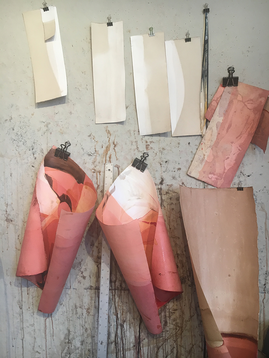
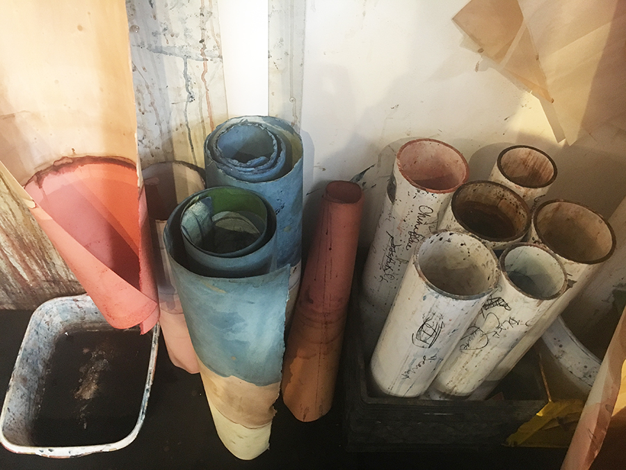 Top: Dyed papers drying. Below: Donovan’s dyeing tubes
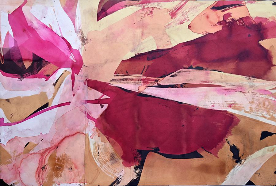
Each tube is filled halfway with a different color, almost all natural dyes. Most of them are of a brown varietal, some reddish and some blue. Donovan’s style could be compared to watercolor due to the ethereal atmosphere that it creates. Or to batik, due to the crinkled lines that form as she uses wax to block certain areas during the dyeing process.
When Donovan first began dyeing paper, she was using primarily commercial dyes. It was the search for a good, true black that pushed her to explore natural sources: “This is pomegranate and iron, and that makes this wicked black,” she explains as she holds up a small jar of what looks like ink.
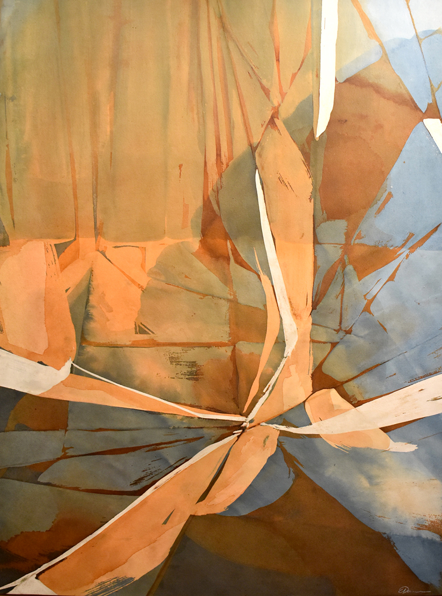 Color Theory (Swan); natural dye on paper with logwood, dahlia, and indigo; 40 x 30”
Even now, working primarily with natural dyes, Donovan still occasionally misses the vibrancy and range of commercial pigments and will occasionally incorporate them into her work. Ironically, green has been the hardest color to produce using natural materials.
“I can over-dye with color theory, go yellow to blue and go over it,” Donovan explained. “But I still haven’t found a good source of vibrant green.”
Since the color of a plant rarely ends up being the color of its dye, oddly enough lilacs make one of the best natural greens.
When working with certain plants, Donovan will let their color or their environment shape the composition of the final piece: “I think it starts sometimes with the color of the actual dye.”
On annual trips to Minnesota’s North Shore, Donovan gathers lupine — a flowering plant — with her husband. When she uses lupine in her own work, it is almost always to represent waterscapes that are reminiscent of the plant’s native environment. In this way, something as impermanent as lupine growing by the roadside becomes a permanent record of its surroundings. Currently, Donovan is getting ready to sell her father’s land. She has been using the alder from the property to create maps of the area.
In addition to her landscapes, Donovan does more figurative series. Recently she has been working with birds. One client has commissioned her to do a series of herons, and in her spare time she likes to represent the geese that she meets on her walks around Como Lake. Her work is as inspired by the seasons as it is by place. In the winter, she describes the geese as frozen “wallflowers” and depicts them coyly milling about in an icy world that blends lake and sky.
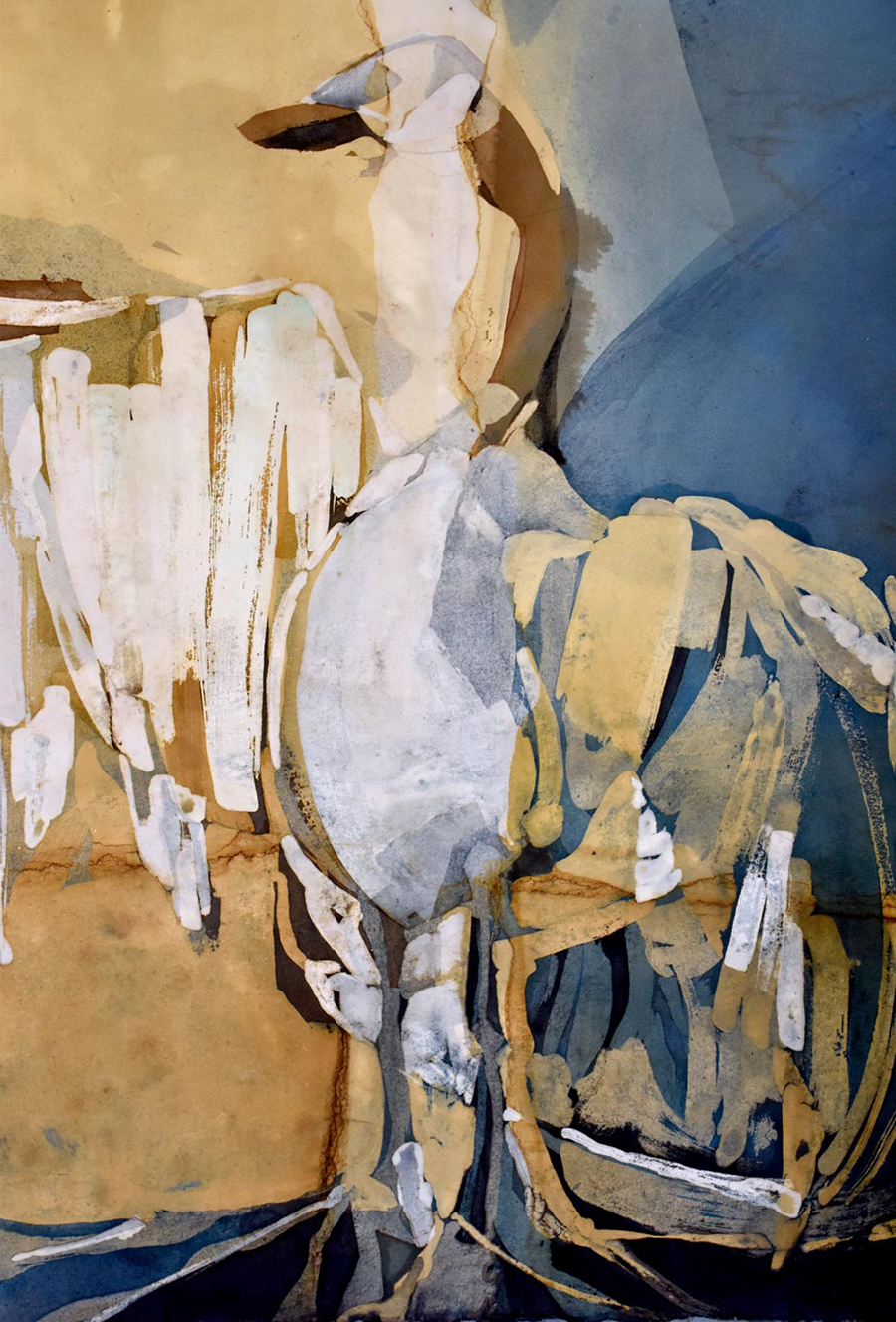 Canadian Goose; natural dye on paper with oak gall, indigo, and iron; 30 x 20”
With the arrival of spring, Donovan began work on a series of trees in bloom, incorporating brighter, warmer colors into her work. For this series, she used stencils to block out the dye, so that she could in effect create a variable edition of prints, drawing on her printmaking background. In addition to having studied printmaking at the University of Minnesota, her father manufactured printing presses.
For the most part, Donovan collects her materials herself. She also accepts donations from neighbors. In 2015, she received a grant that allowed her to experiment with a myriad of different plants, branching out from the tried and true dye recipes that she had been using. It was for this project that she began reaching out to growers in her community, seeking out surpluses.
“A lot of people in Minnesota are traditionally growing a lot of the same things, because we’re in a certain zone,” she explained. “So I’d just walk around and find enough people that were growing the same thing and then drop a card in their mailbox and explain to them what the grant was about and ask if they’d like to participate and donate materials.”
A teacher who lived nearby dropped off a burlap sack of Canadian Thistle on Donovan’s doorstep. Bonnie Blodgett, gardening columnist for the Pioneer Press, donated berries from her garden. Having personal connections to the people donating materials brought added meaning to Donovan’s work.
The ethereal but nostalgic landscapes that Donovan’s process creates have appealed to businesses as well as individual clients. Intelligent Nutrients, an organic health and beauty company founded by Aveda creator Horst Rechelbacher, commissioned Donovan to create a series for their storefront at the Mall of America. The works were called Continuum and drew heavily from the textural elements of a batik-like dyeing process.
“They were all about the sort of crackled little nuances about art and life. It’s not all perfect, and those are the things that make things interesting and pretty,” Donovan explained. “Wrinkles are good.”
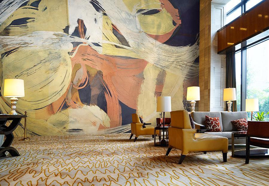 One of the artist’s recent collaborations with Area Environments.
Recently, Donovan began partnering with Area Environments, a local company that collaborates with artists to turn their work into large-scale wall coverings. Donovan recently found one of her works transformed into wallpaper at a restaurant in Indiana.
“The fun thing about it is that they use the colors in everything,” Donovan explained. “In the menu, in all the furniture.”
As we finish talking, Donovan continues to remove works from their tubes and lay them out or hang them to dry. Everything in the studio seems to be moving: Donovan as she switches from piece to piece, wiping off excess dye and examining her new layer of color; the pieces themselves as they curl and uncurl slightly on their hooks; and the images they contain as new layers of dye build up and move across the surface.
In each piece, you can see darker lines that mark the edges of each layer of dye. Donovan explains that pigments tend to gather at the top of the canister and leave this darker contour when she removes the paper. It’s what she calls the “living mark,” tracking the progress of the dye as it moves across and claims the paper. Every plant dye leaves a record of its path behind; the viewer is free to follow the plant’s history in both the subject matter that Donovan conveys and in the physical marks that the plant creates.
 Flight, natural and commercial dye on paper, 24 x 36”
Donovan’s studio (Northrup King Building # 256) is open to the public on the first Thursday of every month. To view more of her work, visit emaluna.com.
Images courtesy of the author and the artist’s website. Banner image: Grist; fern, marigold, dahlia, madder root, and indigo dye on paper; 22 x 30”
We can't do it without you.
Help keep independent arts journalism alive in the Twin Cities.