
Through a Screen, Darkly: “Hurry Up And Wait” at Public Functionary
Published December 25th, 2017 by Russ White
Massive new analog abstractions from printmaker Drew Peterson use bright colors to work through dark times.
As you’re walking up to the door at Public Functionary this month, you’ll be greeted by two six foot-tall sheets of white paper hanging above you on the loading dock. One is largely empty save for “Drew Peterson: Hurry Up And Wait”; the other features a poem by Emily Dickinson, printed large but without affectation in a simple black Helvetica. “The first Day’s Night had come—” it starts, going on in staccato phrases about how a series of horribly traumatic events has forever changed the speaker’s state of mind and soul. In the end, years later, they are left wondering, between giggles, if they have indeed gone mad. It’s a stark way to open a show that’s bursting with color and energy, but it fits what follows.
Hanging inside are fourteen large-scale abstract prints on paper, many six feet tall or more. The pieces explode with bursts of yellows, reds, blues, and blacks, some in exuberant firework displays; some in thick, muddy waterfalls; still others organized by a loose but methodical geometry. There are dark hulking masses, still thickets of foliage, a mangled chain-link fence, a gestural bonfire, and more. The work is, if not joyful, certainly full of life. What ties them all together is their density, each piece thick as a jungle with layers, colors, shapes, and—if you spend enough time with them—history.
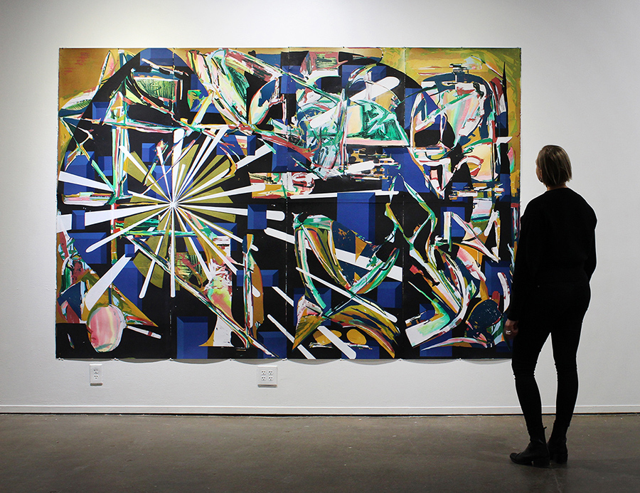 Slow Crawl (installation view), watercolor monotype & screenprint on Rives BFK, 80 x 100”
At the outset, though, what’s most astonishing is that they are all prints. They’re just so damn big, and they look, in places, like highly saturated watercolor paintings. Using a monoprinting technique he learned in grad school at the SAIC, Peterson actually paints the watercolors one color at a time into a screenprinting screen. After letting them dry, he reactivates the pigment with a transparent base, printing the watercolor onto paper with every pull of the squeegee. He applies each color individually and then switches to standard screenprinting ink for subsequent layers, drawing designs on his screens by hand with drawing fluid before pulling the ink through.
“Over the past year, I’ve taken out what you might consider technical shortcuts to the screenprinting process,” Peterson explains, meaning computer-generated films and professional-grade exposure units, “and in their place, switched to an analog hand-applicated approach.” In addition to practical reasons like a lack of space and equipment, “I found myself in a position this year where I needed to develop an outlet for slowing down, for creating a very intentional, ritualistic, intimate way of interacting within this world.” Each print was essentially built by hand, layer by layer, a laborious process with plenty of drying time in between—hence the show’s title.
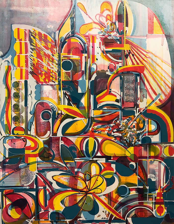 Untitled (Jester), watercolor monotype & screenprint on Rives BFK, 37 x 30”
When asked why he didn’t simply paint the watercolors directly onto the paper, Peterson explains that he likes both the control that printmaking affords him and the deliberation it demands. “I don’t see myself being a full-fledged painter,” he says, “because that direct-to-surface gesture, that act of painting right onto canvas, feels not too easy but too unmeditated. I need to have some sort of mechanism that distances me from those final decisions.”
It’s a surprising distinction because there are so many painterly references woven into this work. You can certainly see shades of Picasso and de Kooning in his largest pieces; in the others I found traces of Marsden Hartley, Chaim Soutine, Henri Rousseau, and Gerhard Richter. No surprise given Peterson’s educational background, and he cops to at least a few of those, some with real delight.
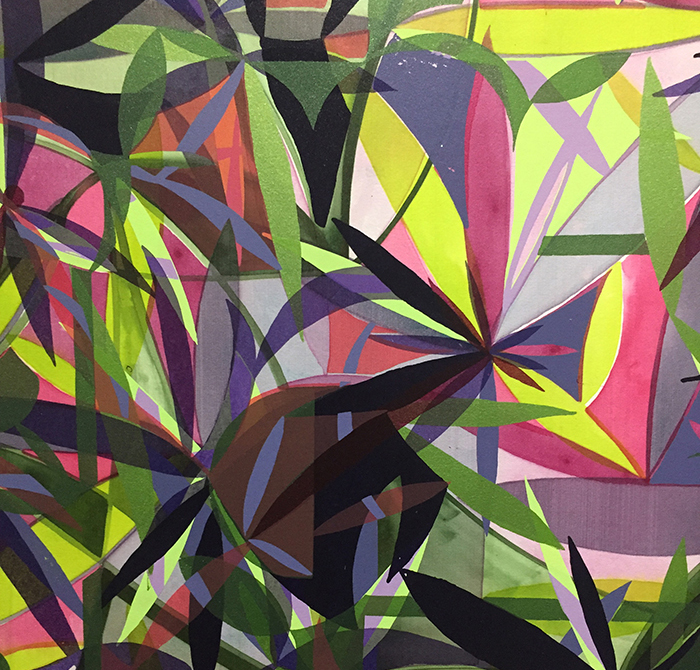 Ardor (detail), watercolor monotype & screenprint on Rives BFK, 37 x 30”
But this isn’t about clever twists on art history; this is about the slow burn of personal history, of living a life. “This work is ripe for me with a year of experiences, of emotional trauma, of mental health crises within my circle and my family,” he says. “It all comes from experience, from something lived. It’s not just formal.”
Weaving these intricate layers of color together, creating a push-pull between foreground and background, between atmospheric space and concrete figures, Peterson gets to the tension in this show. “Because [the prints] are so pushed to this maximal, densely layered state,” he admits, “they do feel past the point of being healthy.”
You might say America is past that point as well. Anyone paying attention has spent the last year waking daily to bad news we could only hope was fake, fed to us by deluge on our devices. Hell, the best news we’ve gotten in recent weeks is that an openly racist serial child molester was barely not elected to the Senate. As one of his titles suggests, this is Life at the Bottom of a Mudslide. Peterson himself sees this show as both personal and political: “The first day’s night”—the initial trauma in Dickinson’s poem—“was the election of Trump.”
Of course, it goes much further back than that. One of the larger pieces in the show is titled The Occupation, a reference to the protests at Minneapolis’s 4th Precinct police station after the killing of Jamar Clark. The piece is dark and severe, its amorphous figures emerging and dissolving in and out of negative space as though Picasso’s Young Ladies of Avignon are out marching in the cold. Next to them, in the most figurative pieces in the show, are an empty big-top tent and a twisted chain-link fence. The circus droops with sadness, but the fencing offers hope. Whatever mangled that fence is long gone, but the chain links hold their history, showing a way through to the brightly colored boulders beyond.
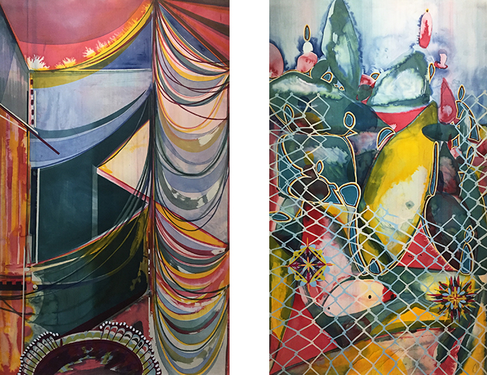 Final Circus (left) and The Opening, both watercolor monotype & screenprint on Rives BFK, 61 x 37.75”
When I asked if he was able to emotionally work through anything by making these prints, he gives a curt “No.” “For me it’s not so much about catharsis… This was a good year of making good work, and now with an understanding of how I made this work, I can pull that forward into the next thing.” The next thing for him will be renovating his South Minneapolis studio, dividing it into a printshop and exhibition space to showcase his work collaborating with other artists as a print publisher.
The next thing for us is maybe not so clear. This exhibition feels like a fitting end to 2017. It is bright, it is dark, it is fresh and new, and yet it is steeped in a long history. There are moments of tranquil beauty, especially in the botanical prints, as well as moments of panic, gasping for air under a mudslide of colors. Ultimately it finds solace not in hope but in work. There is a way forward, but it will not come easy. As this absurd, destructive, exhausting year comes to an end, yet another unfolds beyond it. If you find yourself looking now, at year's end, merely for catharsis, for redemption, this show offers some sadly prudent advice: hurry up and wait.
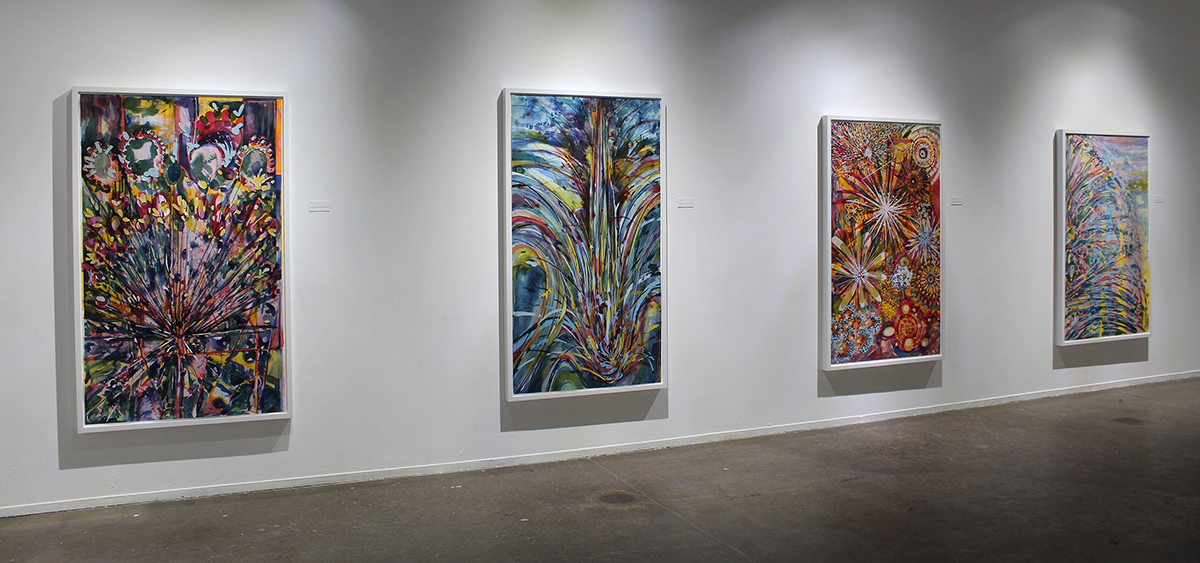 Installation view
Hurry Up And Wait will be on view at Public Functionary through January 13th, 2018. There will be an Artist Conversation Friday, January 12th at 7pm. Gallery hours are Tues/Thurs 12-6pm and Sat 12-7pm. For more info, visit publicfunctionary.org.
We can't do it without you.
Help keep independent arts journalism alive in the Twin Cities.