
On words and wars: Harriet Bart & Jeremy Lundquist
Published April 11th, 2019 by Russ White
Ahead of their upcoming Discussion Series, two of the McKnight Foundation's 2017 Artist Fellows talk to us individually about their practices.
 Article made possible thanks to the McKnight Visual Artist Fellowship Program. Administered by the Minneapolis College of Art and Design.
The following is the fourth and final in a series of articles profiling the eight distinguished artists chosen as 2017 McKnight Fellows, a grant program for mid-career artists that is administered by the Minneapolis College of Art and Design. (The first, second, and third articles in the series are worth checking out, too.) These two artists will take part in the McKnight Discussion Series on May 17th, talking publicly about their work with Irene Hofmann, the Phillips director and chief curator at SITE, Santa Fe. Russ White met the two artists individually ahead of time to understand what drives their practices.
•••••••••••••••••
 Photo by Rik Sferra.
Histories are written in black and white, as words on a page, faces in a photograph, or lines in a ledger: the truth in transcription. Truth is a valuable commodity, to be sure, one in increasingly short supply these days. But the past has to speak through interpreters. There’s always some data lost and some added, like a game of telephone with our ancestors, many of whom were never allowed near the phone to begin with.
Those are the voices that interest Harriet Bart. Her work—itself often black and white—is an ongoing exercise in remembrance, memorializing the stories and sacrifices of soldiers, workers, refugees, and writers. Her studio practice is built around intuitive responses to found objects and historical texts, using them in installations, paintings, sculptures, assemblages, and hand-bound books: blank dogtags on a chainlink fence, long scrolls of hand-written names, cast bronze pomegranates, a pile of numbered stones… It’s a wide variety of media that remains surprisingly unified by a singular aesthetic: refined, somber, and severe. “My work is conceptually driven,” she explains, “so I pick materials that best speak to the subject.”
Her subjects provide a through-line as well, paying homage to tragedies from the Triangle Shirtwaist Fire to the World Trade Center to American casualties in Iraq and Afghanistan. Bart's work is dark but dignified, at a fair distance from despair. It does not shout slogans; it whispers prayers. She mines the black and white of history, looking for the gray and the gold.
I was lucky: when I visited her studio she was preparing for a visit from conservators at the Weisman, which will be mounting a career retrospective of her work next year. So she had everything out, work spanning more than forty years, meticulously sorted and displayed on tables and walls like a miniature museum. Bart’s career began in the ‘70s, when she was a founding member of WARM, the Women's Art Registry of Minnesota, an art collective and gallery space that has evolved today into Women’s Art Resources of Minnesota. She worked first in textiles, pushing back against patriarchal ideas about craft and so-called women’s work. It’s kind of amazing to see an entire career laid out in a single room, even in snippets, not least of all because the work speaks across decades with the same voice, towards the same concerns. She laughs at this, admitting, “I’ve been so worried that it looks like a group show!”
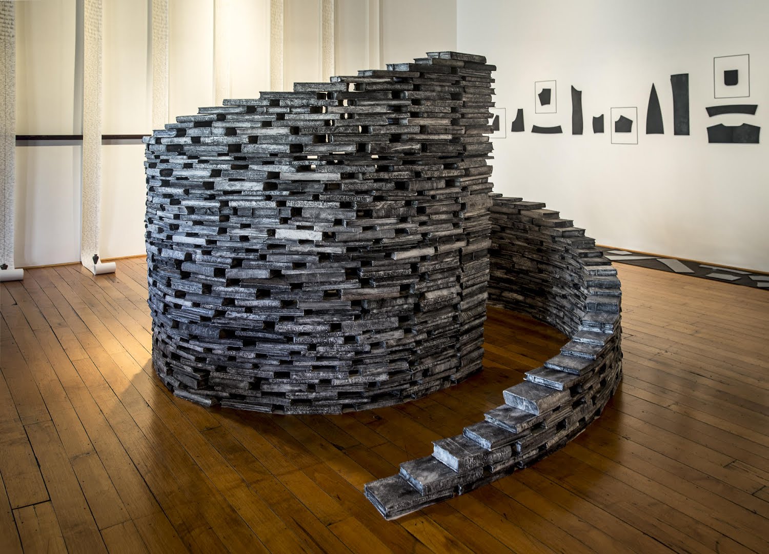 Foreground: Forms of Recollection: Storied; altered books, acrylic, sand, string; 8 x 9 x 5 ft; 1989/2017. At left: Requiem (Inscribing the Names: American Soldiers killed in Iraq); paper, ink, plumb bobs, cord; 12 x 12 x 3 ft; 2003-2011. At right: STRONG SILENT TYPE; blackened steel, magnets, mirror finish chrome steel, felt backing; dimensions variable; 2016.
But nothing seems particularly out of place, ranging here from tiny table-top assemblages to large installations. Taking up the most real estate is Forms of Recollection, a five foot tall spiral wall made of gray brick books, actual texts that Bart has tied with string and coated in an ashy gesso, never to be read again. At first the piece seems ominous (timely, even): an austere wall made of destroyed books, an act of exclusion and censorship. But that's not it at all. The wall itself welcomes you into its spiral like a brutalist book nook, the titles scrawled into the painted spines forming a playful sort of instant poetry. Most of the books, Bart explains, were actually rescued from landfills, doomed for destruction regardless and now granted a longer life-span as building blocks. “The book is such an incredible signifier,” she says. “It’s potent: every idea, every thought, every thing ends up in a book.”
No surprise then that her practice began to include actual book-making, beautiful works of laser-focused obsession. They’re not so much documentation of her work but pieces unto themselves, expanding on and exploring ideas from her larger practice. One book pairs pages from a nondescript ledger of female names and payments they made with mid-20th century snapshots of unknown, everyday women. Bart then scoured thrift stores and textile shops, looking for fabric swatches that closely match the anonymous women’s clothes: a few square inches of plaid, for instance, or a specific floral pattern. Titled Garment Register, the piece is itself a kind of poem, a collage of history weaving together forgotten people, rediscovered fashion, and debts long paid. It’s a funny kind of remembering—lots of details and yet no specifics—and it’s hard to decide if the book is joyful or sad. Again, the gray and the gold.
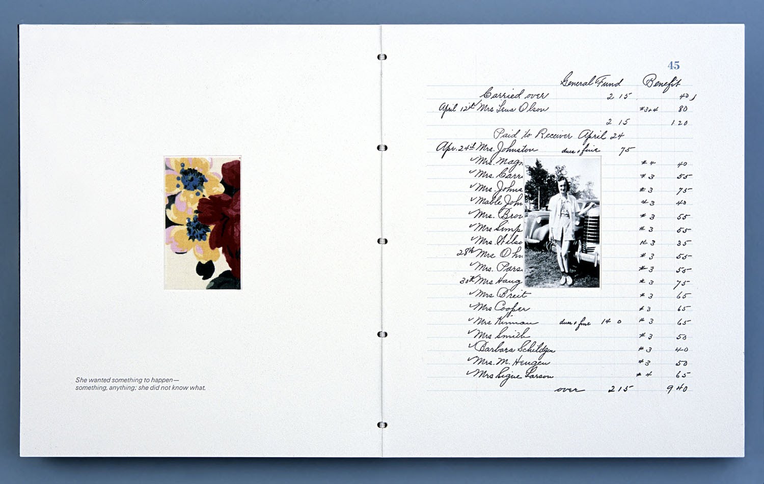
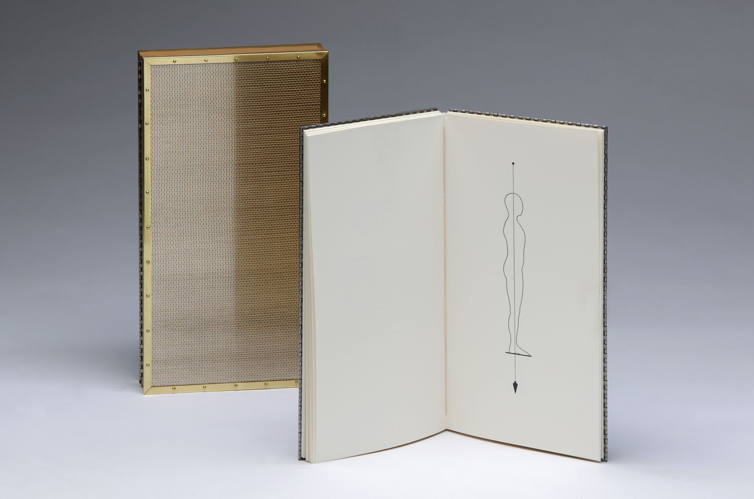 Top: Garment Register, letterpress on Rives BFK 280GM, 12 1/8 x 10 x 1 1/4" (closed), 2000. Bottom: Plumb Bob, letterpress on Koch Antiqua and FF Meta on 200 lb Fabriano Artistico, 11 ½ x 6 ½ x 1 ½" (box), 2009.
Another book is devoted entirely to plumb bobs, the hanging weights that use gravity to find a true vertical. She has used them in several installations over the years, in part quite simply because, she says, “I like the shape.” It also has a long, rich history, from ancient Egyptian architecture on, offering scientific clarity with artful simplicity. But over the course of creating this book, she found it to be a symbol for character, for moral rectitude and righteousness. As most plumb bobs were originally made of lead, the book begins with the Periodic Table symbol Pb, but it ends with the alchemical symbol for lead. “So it’s also transformative,” she says, “and I was transformed doing it. I thought I was doing one thing and ended up doing something else. But that’s the nature of art, right?”
Bart shows me several other works: a beautiful installation of blackened steel dress pattern pieces, laid out flat like minimalist plates of armor; altered books covered in shards of glass or cut out to create shadowboxes; mixed media paintings featuring erased text and knotted strings, a nod to the lost science of khipu. They are, again, dark studies in grayscale, sometimes elegiac, other times a muffled scream. So the giant pile of brightly patterned fabric bundles in one corner of her studio stands out as a bit of a departure.
This is Bart’s newest project, an on-going collaboration with fellow artist Yu-Wen Wu, working with refugee women from across the globe to document their stories and create these bundles, the size of a knapsack or baby bjorn. The pile, which will grow over time and be exhibited later this year at SITE Santa Fe, is a mixture of fabrics, colors, and patterns, roughly lashed together in these little parcels, some with handwritten stories attached. She picks one up and tells the story of a woman barely escaping after the boat she was on capsized in 1991 off the coast of Somalia. These bundles are less refined, less polished than her previous work, but their humble construction makes them almost more real, heartbreaking and comforting at the same time, living histories in living color.
•••••••••••••••••
 Photo by Rik Sferra.
When it comes to American military incursions, it’s not quite true to say we are doomed to repeat our past mistakes. Sometimes we repeat them; other times we manage to come up with all new mistakes. Either way, we save the doom for others.
And what better medium to illustrate that steady, self-assured slide towards chaos than printmaking? Newspaper publishers do it every day in fact, though not always with the same simmering anger and palpable disgust that Jeremy Lundquist brings to the printed page.
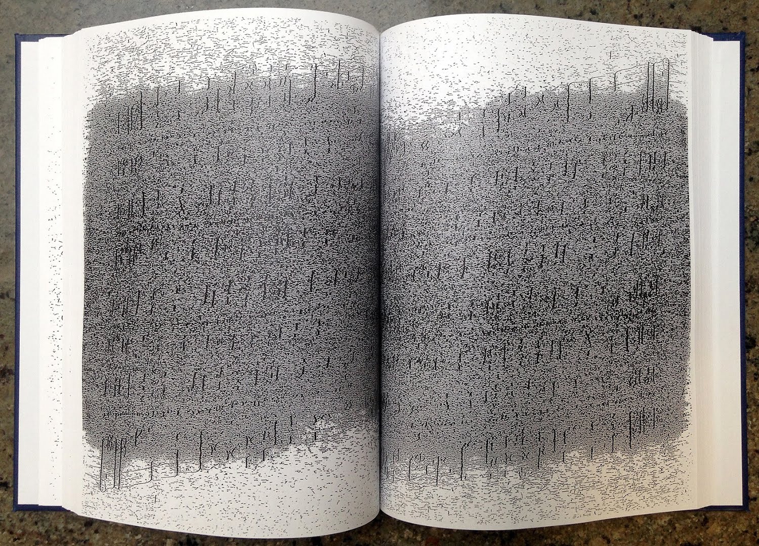
I should say pages, though, because there are a lot of them. Our studio visit consists mostly of flipping through stacks of paper, sheet after sheet, revealing print after print—all in very limited editions or simply as monoprints. He starts with a series of what he terms progressive etchings: different prints made using the same plate. The process itself creates a commentary on information overload and erasure, as the ghosts of past prints build up over time, creating a fog of aberrant details in the background of successive prints.
The subject, in this case, is military intelligence, a phrase George Carlin once disparagingly compared to "jumbo shrimp." The piece is called Stability Dynamics, a series of twenty etchings installed in a large grid, recreating an absurd diagram created for the Pentagon in 2010 that attempted to explain the situation in Afghanistan with a bunch of bullet points and curved arrows crossing each other willy-nilly in a massive, incomprehensible cloud. The diagram is like Cy Twombly in PowerPoint, maddening in its faux precision and reductive logic. General Stanley McChrystal is quoted at the time joking that “when we understand that slide, we will have won the war.”
Lunquist’s version gradually amplifies the chaos from page to page, ending in the middle with a hazy hot mess of arrows and verbiage, information still barely legible from all twenty pulls off the same plate. “For me,” he explains, “that history, that build up of scraping away, was a way to comment on how much it failed as a diagram. It’s trying to be clean and precise, and nothing about [the war] is clean and precise.”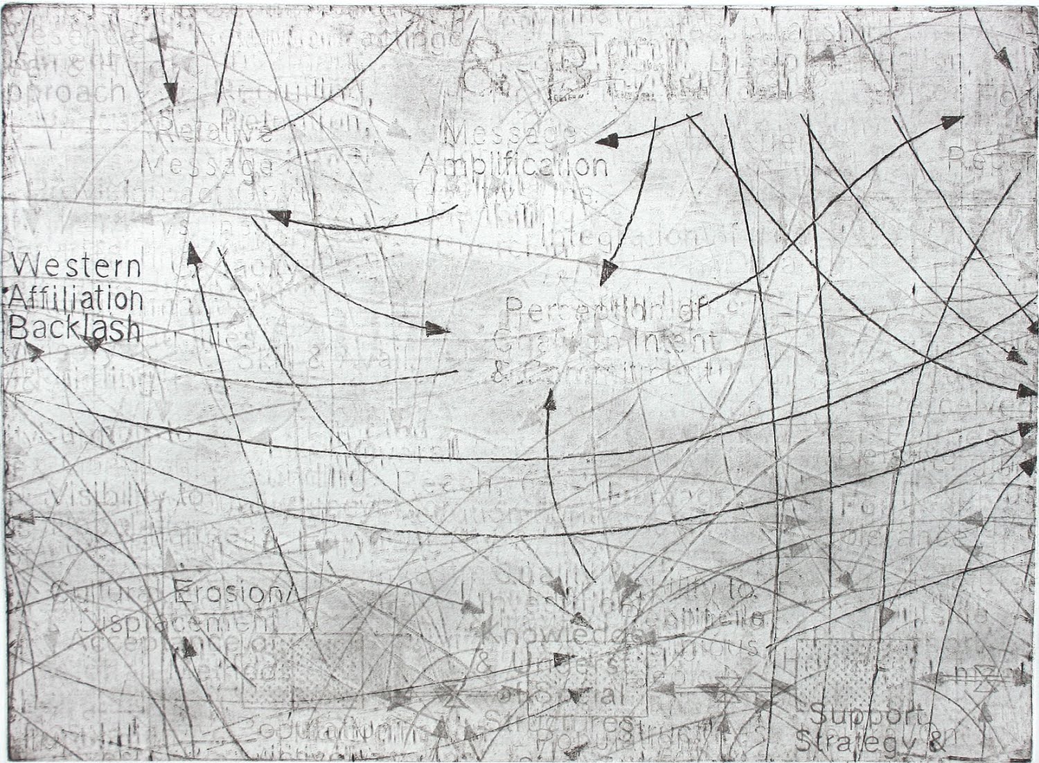
 Top: Stability Dynamics: Backlash, etching, 22 x 28", 2013. Bottom: Recognized Impossibility (installation view), solo exhibition at Highpoint Center for Printmaking, 2017.
This progressive method shows up in other print series as well, such as a recreation of a Trump campaign sign that reads simply PROMISES MADE. It’s so Orwellian, this piece of real-life propaganda, that you can hardly tell if it’s earnest or ironic anymore, another bizarro mile marker on the road to tyranny, another arrow in the ankles of satire. In Lundquist’s care, the sign completely degrades over just six prints, the blue and white sign ending in a scratchy, blotted, bloody mess of Republican red.
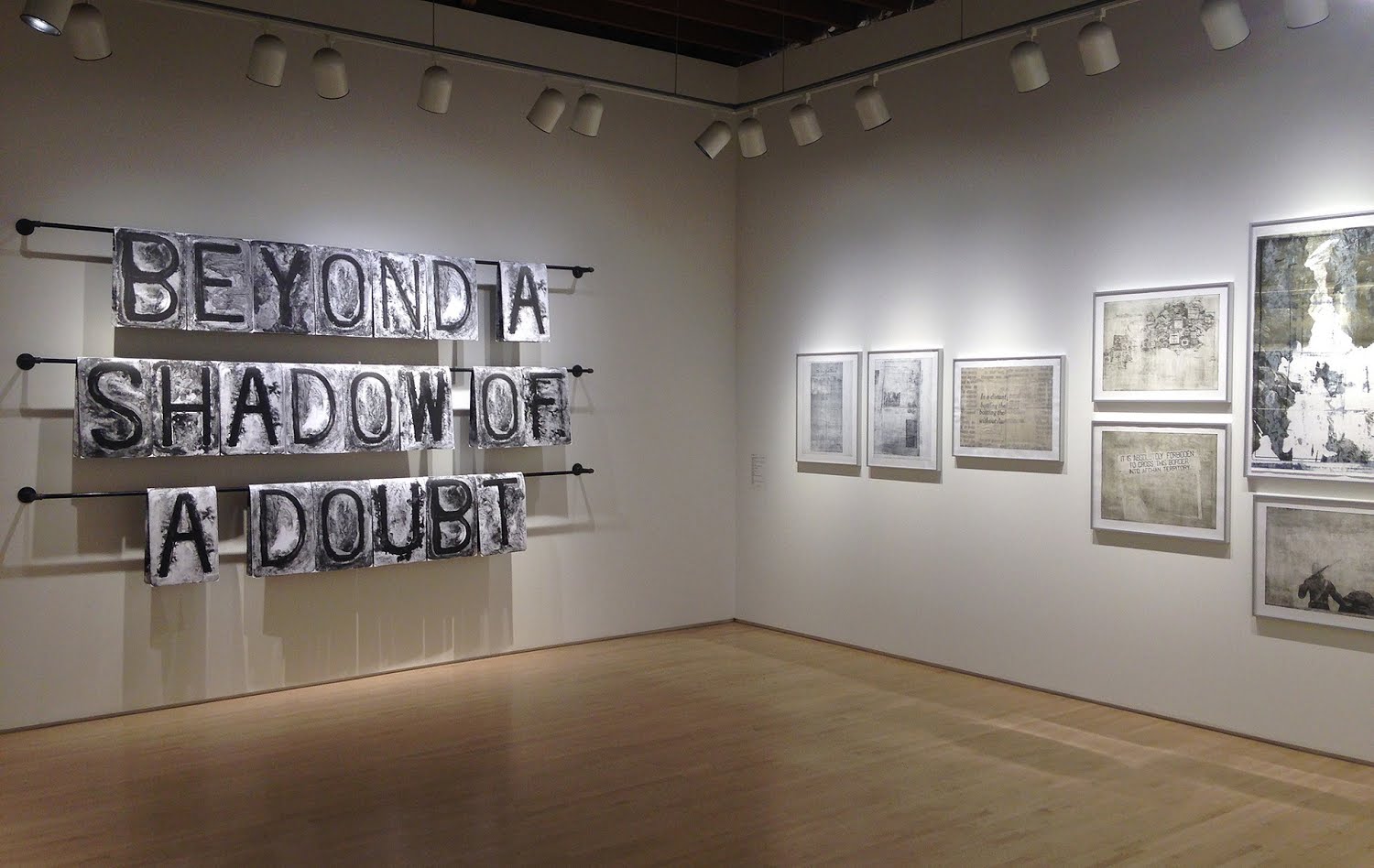
There’s something I’ve always admired about printmakers: theirs is a physical, laborious, and very technical practice. In creating the large letter blocks for another installation, spookily spelling out the phrase BEYOND A SHADOW OF A DOUBT, Lundquist spent a good half-hour graining his litho stone, effectively grinding the stone clean by hand between the printing of each letter. Not content to stop there, each piece of paper actually features four different letters, folded up and hung on a rack, again like a newspaper. This is time-consuming work, especially in the age of Adobe. He points out that you can even see a blemish in the litho stone disappear over the course of the prints as it was slowly ground away by the repeated cleaning process. Anyone paying attention to current events can relate, as we’re all being ground down, purposefully I think, by a daily deluge of outrage and falsehood.
This fascination with degradation and data loss works particularly well in Confidence to Sing, a departure from traditional printmaking methods. Lundquist has taken a single line from a Christian hymn, complete with musical staffs, and xeroxed it over and over again on a page, and then xeroxed that page over and over and over again, and over again, and again, about 150 times in total, watching the image degrade and distort each time, until a page of clear (if redundant) music becomes one big nasty, slurred rhombus of gray toner. It is hilarious in its simplicity, all the more so because of the presentation: neatly bound into a blue-backed hymnal in an edition of four (“for a soprano, alto, tenor, and bass,” he explains). The line, from “Asleep in Jesus,” is “confidence to sing That death hath lost its venomed sting.” The text itself has died at the hands of a Kinko’s, although Lundquist reverses the process back to legibility by the end of the hymnal. This too, though, he relates to war. “In my mind,” the artist explains, “that line directly relates to our desensitization to violence. You just let it wash over you.”
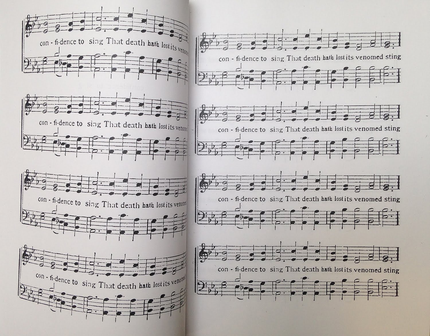
Details of Confidence To Sing, four books printed by the artist using a photocopier, 12 x 9", 2017. Top: early in the hymnal. Bottom: the same page after being photocopied 150 times.
It’s interesting to talk to an artist with such a minimal investment in beauty. None of his works are ugly really, and some of the Stability Dynamics prints are actually quite beautiful on their own, but he has been hesitant to indulge too much in that kind of pleasure-seeking. His source material is too damn real. “It’s about warfare,” he says, “and war has been aestheticized throughout history. If I purposely do that too much, I feel like it’s not serving the dialogue very well.”
Communication, it seems, is the whole point. He ties the success of his work to its ability to find an audience. “I’m not really interested in the work just being made,” he says—the art needs to be seen. They say sunshine is the best disinfectant; here’s hoping gallery track lights still have some potency, too. We need all the help we can get.
We can't do it without you.
Help keep independent arts journalism alive in the Twin Cities.